Celebrating six years of IM-PRINT IM-PRESS

Article by: Gaynor Orvis
Publication date:Each year, second-year BA (Hons) Graphic Design students are asked to enter a live-brief to propose a design that celebrates the materiality and physicality of print through paper, foil and print production.
The competition aims to inspire a new generation of graphic designers at Ravensbourne to not just focus on the visual elements of the design, but also to appreciate the feel of their designs from format and material to production.
Each year, the winner's work has been professionally produced in the edition of 100 copies by Baddeley Brothers, using Foilco and G. F Smith paper.
We caught up with Charles Pertwee, the director at Baddeley Brothers and one of the IM-PRINT IM-PRESS judging panel, and three talented past winners to ask them what the competition means to them.
Jaqueline Brantschen, 2018 winner
Tania Pereira's display at G.F Smith
Luc Crossley, 2022 winner
IM-PRINT IM-PRESS 2022 winner Luc Crossley
IM-PRINT IM-PRESS 2017 winner Gabriel
IM-PRINT IM-PRESS 2020 winner James Rachel
Charles Pertwee, director at Baddeley Brothers
Why do you feel it is important for students and brands to get involved in a collaboration like this?
I think when it comes to graphic design, so much of what the students create nowadays tends to be digitally focused. This module is designed to take them away from that. It tests them in a different way.
They have to think within the parameters of production, and they have to ask the right questions. How does it apply to foil? How does the paper fold? How will it actually be produced in a mechanical sense?
Then they also have to think about how best to present their ideas. After that, they have to go away and translate what their design should actually be.
How do you think the exhibition has evolved over the years?
I think it's certainly got a lot more ambitious, which is great. For example, this year, we saw a double use of the dye, which we hadn’t seen before. The designs have definitely got more visually striking too.
Maybe that is down to us tweaking the brief a little bit. I think it gave students the opportunity to do a lot more folding, and this created more visual impact.
Do you have any advice for students getting involved?
I think one of the key things is to understand the constraints of the brief. It’s important to keep in mind things like the budget and the limitations of what can actually be produced in a commercial environment.
Producing a one-off piece for something elaborate is entirely possible, but the students have to think about whether it can be easily replicated in production.
So in that sense, there are restraints to consider, and I don’t say that in a negative sense. I think it's actually a positive thing because in commerce and the world of work, you’re not going to be working with an unlimited budget. You have to be able to work within the confines of the resources available to you. On a practical level, you can’t always do exactly what you want, but that forces you to get more creative.
Hopefully, the skills that are being developed during this work will help students beyond their time at Ravensbourne.
Is there anything else that you’d like to add?
I think the fact that the competition has now been running for six years is a testament to just how successful it's been. We managed to continue even through the pandemic, and we were happy with how it went, despite the obvious limitations.
I think for us, it gives us a really useful understanding of where the students are coming from and what they’re thinking. I think the feedback that we get from the students themselves is of great value to us.
Working with the likes of Foilco and G.F Smith for all these years on this project, as well as the lecturers at Ravensbourne has been really rewarding. Hopefully, it's something that will continue for many years to come.
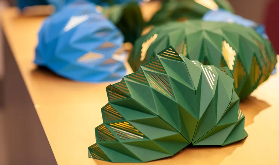
Tania Periera, 2019 winner
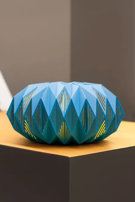
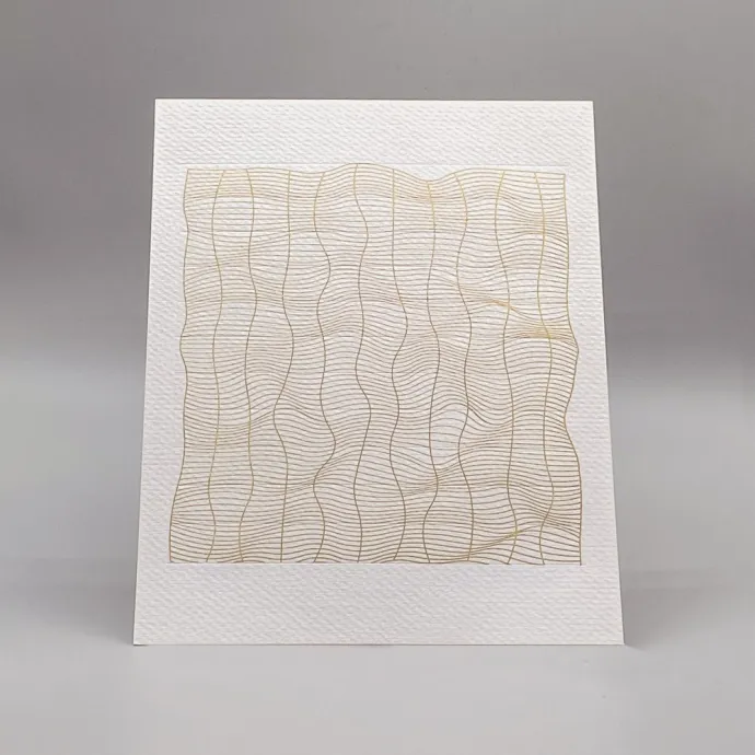
My design combines a number of techniques, including gold foiling blocking, blind embossing, duplexing, and black engraving, to create a design that celebrates dimensionality and construction.
Inspired by Waldo Nell’s microscopic peacock feathers photography and the opening and closing movement of peacock feathers, my design uses layering and repetition of Tabriz Blue and Forest Green from the G.F Smith Colorplan paper collection. This selection of paper showcases the way a simple three-dimensional paper object can open into a complex symmetrical shape.
Demonstrating careful consideration of dimensionality and how the piece will look once open, my design incorporates gold foil blocking through the middle of the design to highlight detailed areas and add gravity, resulting in a compelling design that catches the eye.
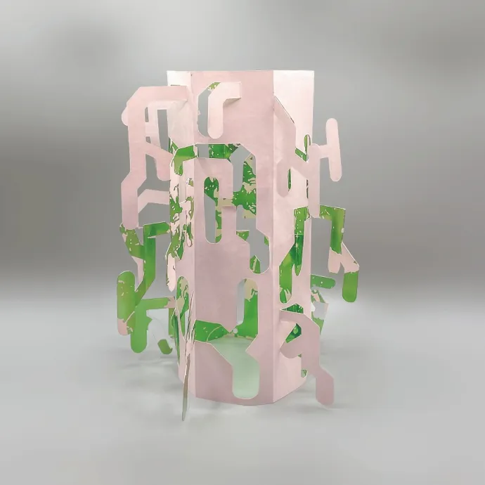
Nelly Dos Santos, 2021 winner
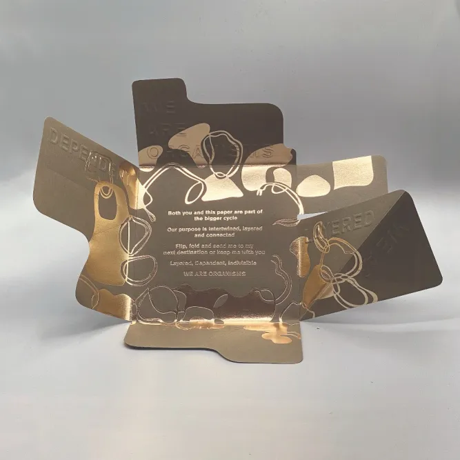
The brief centred around some new extractions of paper that G.F Smith had brought out that were made of recycled cups. The restrictions were that you could use a three-colour set of G.F Smith paper and one bit of A4 foiling. And this obviously would dictate the way in which you printed and produced the work.
So when I was thinking about the brief, I explored the idea of cycles. I could see that the whole process was a cycle; so physically with the process of making the paper, but also the way in which it was connected to our own routines.
Personally, I always have a coffee in the morning. I explored the way in which the paper began life as a coffee cup and was then re-used and entered an entirely different system. Through the recycling process, it was put back into the community and was given a new lease of life as beautiful textile paper. It would then go to a designer, and they would make something great out of it.
The brief asked us to make an envelope or some sort of folding design, as it had to fit through a letterbox. We completed our brief during the pandemic, so whereas in previous years, students had to create an installation, there were limitations in terms of what we could do. But I think the restrictions, rather than being a hindrance, allowed us to think differently and get really creative.
Thinking about the cyclical nature of things, I thought about what is important to me personally. In my own circle, I’m very community based. I really value the importance of community. With this idea in mind, my piece wasn’t about something that could be technically used, but instead was about the sentiment behind it. It turned out to be a folding envelope with an inspiring message embossed inside it. This served as a reminder of how interconnected we all are. There was also a little illustration inside it. The design meant that you could open up the envelope, flip it around and fold it back on itself. You could then pass on the envelope on to someone else and share the message with them too, and so it could continue in its own little cycle.
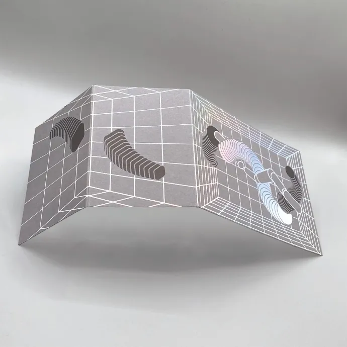
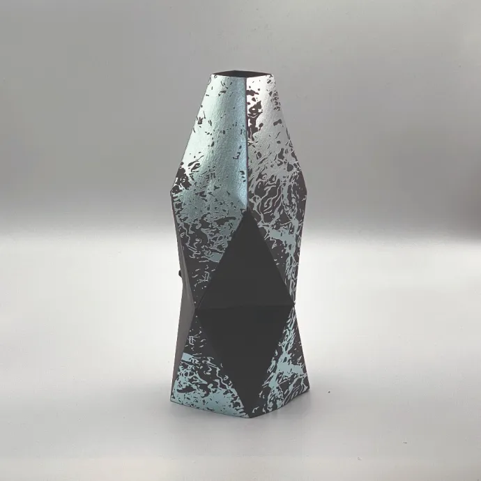
Luc Crossley, 2022 winner

With my piece, I wanted to take a more scientific interpretation of the brief. For the project, I looked at what scientists are doing to help with the overabundance of plastics on the planet. This led me to the topic of the ‘super-enzyme’, which is being engineered to eat away at plastic. I also wanted to move away from the origami-based designs of previous years and focus on a more structural paper model instead.
This idea, and interpreting how best to demonstrate the enzyme, led me to create a monolith structure to represent plastics with a plain, geometrical look. I showed a stylised enzyme cut out of the main structure to look like it had eaten away at the structure, leaving the green inside to be shown.