Concept and creative process
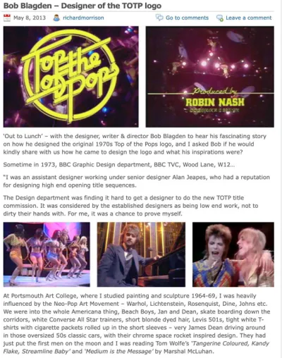
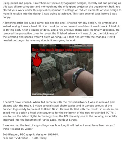
Designer Bob Blagden, now a film and TV director, recalls creating the iconic ‘Top of the Pops’ logo: “In 1973 I was an assistant designer working under senior designer Alan Jeapes, who had a reputation for designing high-end opening title sequences. ‘Top of the Pops’ had just appointed a new series producer Robin Nash, who was looking to make changes in the show’s format, among them the opening titles. The Graphic Design department was finding it hard to get a designer to do the new ‘TOTP’ title commission, not least because the job involved a lot of ongoing weekly programme servicing of chart lists, credits etc., not just the titles – they were the cherry on the top. I put my hand up for it, seeing it as a chance to prove myself. I’d never designed a logo before and I’d never been taught the nuances of graphic design at college, where I had studied painting and sculpture. It was a massive challenge – a make or break situation. I looked through a lot of my art books including a photographic coffee table book on 1950s US cars that I rated as being the real sculpture of the time, the people’s commercial art. This became my source of inspiration for the ‘TOTP’ logo, the lettering on the Chevrolet, Chrysler and Pontiac cars, linked up by a metal line that connected each letter, so that they could be manufactured in one piece. I made a series of rough sketches and went to see Robin Nash and showed him my various ideas for the new logo. Fortunately, he chose the one that was my personal front-runner and greatly relieved, I set to work to refine the design and produce the finished artwork, as this logo would be used not only on-screen but also on all of the show’s publicity material, letterhead, press releases etc. Using pencil and paper, I sketched out various typographic designs, literally cutting and pasting as this was all pre-computer, and I monopolised the only Grant projector the department had, which was a piece of optical equipment that enabled you to enlarge or reduce elements of the design until it resolved into what you were trying to achieve visually.
When I was finally satisfied, I commissioned lettering artist Ted Cload to create the finished artwork. After one attempt he achieved the perfect result. I made several different sized photocopies in various colours of the finished logo and presented them to Robin Nash. He was thrilled with the result, so much so that he asked me to design the whole title sequence for the re-launch of the new re-branded ‘Top of the Pops’. The main part of the sequence was film specially shot by the production, but the 30 to 1 countdown to the logo was my work. To produce the sequence, I got to use the latest digital technology from the US, in the basement of the Rank Film Laboratory in Wardour Street in London’s Soho, where the drawn images were digitised and manipulated and output to film. I was warned that the test of a good logo was how long it would last – mine must have been OK as it's still being broadcast on BBC2 edited 'TOTP' Specials almost 50 years on.”
More Information
Bob Blagden interview
Bob Blagden interview 1
Bob Blagden interview 2