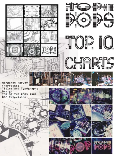
Concept and creative process
The concept behind the design of this title sequence for the weekly live pop music show ‘Top of the Pops ‘ was a race up the Top 20 chart between competing CDs. The CD had over the preceding years established its position in the market and designer Margaret Horrocks decided to fly them like satellites through a high-tech maze of industrial corridors, filled with animated TOTP logo sequences on video screens, to emerge after a fast-paced countdown ‘through’ a logo and into the live studio. The title sequence model was over 6 meters long and referenced structural elements of the TOTP's studio set and CD manufacturing equipment. Front-silvered mirroring seamlessly backed the model's corridors to prevent double imaging, whilst providing opportunities to create infinite reflections and to give scale to the environment.
Model Set Construction – ARTEM.
Motion Control & Lighting Cameraman - John Swinnerton, Moving Picture Company.
Editing and Computer Animation - Moving Picture Company.
Designer/Director - Margaret Horrocks (Harvey).
Winner of a Design & Art Direction Wood Pencil for Television Titles 1989.
More Information
Top of the Pops storyboard and typography
Top of the Pops storyboard and credits

Top of the Pops typography design