Concept and creative process
‘The Taste of Health' featured meals cooked with fresh healthy ingredients. The title music that the programme director had chosen, which had a lively, ‘choppy’ tempo, engendered the idea for designers Liz Jones (now Varrall) and Fen Field that various ingredients should ‘prep’ themselves, in a cel animation using an illustrative technique. Once the designers' storyboard was approved, Fen worked on the style for the illustrations, before designing five key layouts with ingredients which would variously seem to fillet, stir and chop themselves up, in time to the music. The format for the illustrations needed to be 600mm wide x 300mm deep, so that the camera could pan along as the ingredients animated. Next, the animator, Brian Larkin of Animation People, worked out the ‘in-between’ drawings for a filmed pencil test to make sure that the animation worked, using jump cuts between each drawing every two frames, to ensure the action matched the fast tempo of the music. The budget was small and time was tight, so the designers and about 5 assistants worked all weekend to produce the artwork, following the animator's pencil layouts. There were three layers to all of the illustrations, a pegged background which remained throughout, pegged cel overlays with simple, stylised cut out tissue paper 'ingredients' pasted on them and further pegged cel overlays with blue wax crayon defining lines. The final 35mm film and soundtrack were edited in the Graphic Design editing suite.
More Information
The Taste of Health fish artwork
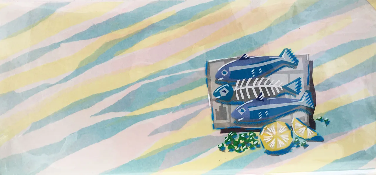
The Taste of Health fish artwork
Designed by Liz Varrall and Fen Field, animated by Brian Larkin at Animation People. Artwork was made by Liz and Fen and assistants at the BBC Graphic Design Department.
This is the background for the initial pan onto the fish on newspaper, filleting themselves.
The background - a collage of blue, pink, yellow and white coloured tissue paper, was used throughout the animation. The fish and newspaper are tissue collaged onto the first cell. The blue crayon shadow and white highlights are on the 2nd top cel. This style was used through the whole animation.